Assignment 3: Orange
Plan:
My plan for this shoot to capture the color orange is to get it from the sunsets.
My Photos:
For this shoot I waited for a night with no clouds so I could create a kind of gradient sunset. I waited until I cold barely see the sun any more and for when the sky first started to make color. I kept my shutter at a medium setting and had a higher ISO to bring out the color on just the camera. My favorite photos were the ones with the dead tree outlined and curved mountain line with a darker orange closer to the mountains and lighter further away.
Edits:


I edited these photos mostly in lightroom because I really just needed to adjust the level of light, lights, darks, and noise in the photo. I did edit one photo in photoshop when I was done with it in lightroom. I used the clone stamp tool to remove some telephone poles that were in the background. I did this to the photo I knew I was going to print. I also added lighters vignettes to the corners because it helped with that kind of gradient look. I really like the deep orange that I created.
Printed Photo:
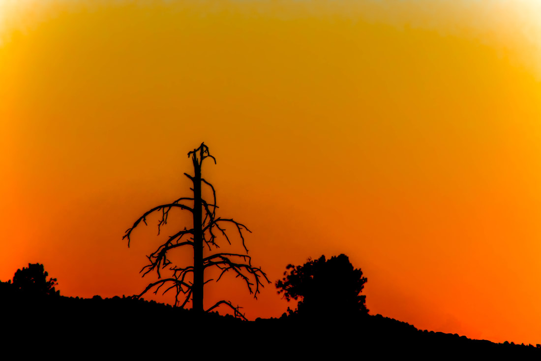
This is the photo that I printed on semi- glossy paper because the paper gives the photo a more connected look in the different shades of orange. The semi- glossy paper really helped bring out the deep orange color that I liked. I matted my photo on a black matte because it looked really good with the silhouettes of the trees and mountain. I printed this photo because I really like how you can see the detail on the dead tree even thought it is just its shadow. I also like the land isn't flat in this one but is sloping from one side to the corner. This helps make the photo a little more balanced by not having it be perfectly symmetrical. The uneven sides help draw attention to what is strait, the dead tree. The dead tree works really well at being the focal point (kind of close to a third) because it is the first thing that the viewer notices. There are many different shades of orange in this photo which is something that I am always looking to get for this portfolio, more than one shade/ view of a color. I thinks it's cool how this Colorado sunset looks very similar to a sunset your might see in Africa on the sahara. The different shades of orange help to bring out a warmer feeling while the dead tree makes a more fear full feeling. These two moods work really well with each other because they can help create idea that behind every scary thing, their can be something good and happy. I think that this was a very successful photo in capturing the color orange.
